Two Toned Paint Ideas for Every Room: 8 Schemes and Tips
Discover 8 two toned paint schemes for kitchens, walls, ceilings, trim, and exteriors, with color pairings and practical implementation tips for homeowners.
By Excellent Home Improvement & Remodeling
Why do some two-tone rooms look intentional and polished while others look as though the painter stopped halfway through? Usually, the difference isn't the color combination. It's whether the dividing line belongs to the room, the finish suits the surface, and the preparation holds up under daylight.
Two toned paint can make a straightforward repaint feel custom-designed, without moving walls or replacing every finish. But a horizontal stripe across uneven plaster can emphasize a crooked corner. Dark cabinets can look sharp beside cream uppers, then look disconnected from a cool gray backsplash. In NYC housing, those details matter as much as the paint chip.
The most buildable schemes use boundaries that already exist: cabinet runs, chair rails, crown molding, door casings, vanity edges, and stair components. The options below cover cabinets, walls, ceilings, trim, staircases, vanities, and exteriors, with practical guidance on where to split the colors, which sheen to use, and what to prepare first.
Start with the boundary, not the accent color. If you can't explain why the color changes at that particular edge, reconsider the split.
A prewar apartment, a Bronx co-op, and a Brooklyn brownstone don't need the same treatment. Choose the scheme that works with the building you've got.
Table of Contents
- 1. Two-Tone Kitchen Cabinets (Upper and Lower Contrast)
- 2. Two-Tone Walls with Wainscoting or Chair Rail Split
- 3. Contrasting Ceiling and Wall Colors
- 4. Tonal Two-Tone (Same-Hue Light and Dark)
- 5. Two-Tone Bathroom Vanity and Walls
- 6. Two-Tone Exterior Body and Trim (Brownstone and Townhouse Style)
- 7. Two-Tone Trim and Door Scheme
- 8. Two-Tone Staircase (Risers and Treads Contrast)
- Comparing the 8 Two-Tone Paint Schemes
- Picking Your Split and Choosing the Right Two-Tone Scheme
1. Two-Tone Kitchen Cabinets (Upper and Lower Contrast)
Cream upper cabinets and muted navy base cabinets can give a compact brownstone kitchen definition without adding another material. Keep the color change between complete cabinet runs, rather than switching colors halfway through a bank of doors.
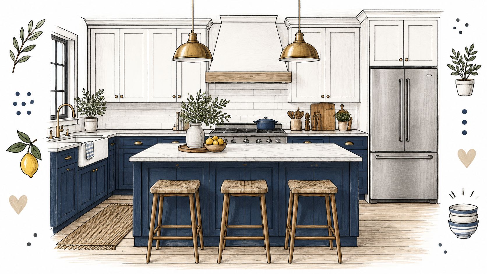
Start with the countertop and backsplash. Warm gray veining can connect cream uppers with charcoal lowers, while an existing yellow-beige stone may fight a blue-white cabinet finish. Test the actual cabinet colors beside those fixed surfaces, under daylight and the kitchen's evening lighting.
Resolve the End Panels Before Painting
A kitchen isn't just doors and drawer fronts. Decide whether exposed end panels, filler strips, toe kicks, and tall pantry cabinets belong to the upper or lower color before work begins. A tall pantry usually looks more deliberate as a complete vertical block than as a cabinet divided at countertop height.
- Prepare for adhesion. Remove hardware, label doors, degrease thoroughly, rinse away cleaner residue, and dull sound existing finishes before priming.
- Specify cabinet coatings. Use a compatible cabinet-grade enamel or waterborne urethane system, not leftover wall paint.
- Coordinate hardware. Brushed nickel, brass, or black should work against both colors. Replacing worn pulls is generally more dependable than painting frequently handled hardware.
Compare painted and stained cabinet finishes while deciding whether every surface needs paint. Natural wood can remain part of the palette.
Skip the contrast when the kitchen already has competing tile, stone, and flooring. In a narrow co-op kitchen, matching the cabinet colors may produce a calmer result than adding another visual break.
2. Two-Tone Walls with Wainscoting or Chair Rail Split
An existing chair rail is the strongest starting point for a horizontal split. In a prewar dining room, deep olive below the rail and warm ivory above can emphasize the millwork without adding decorative clutter.
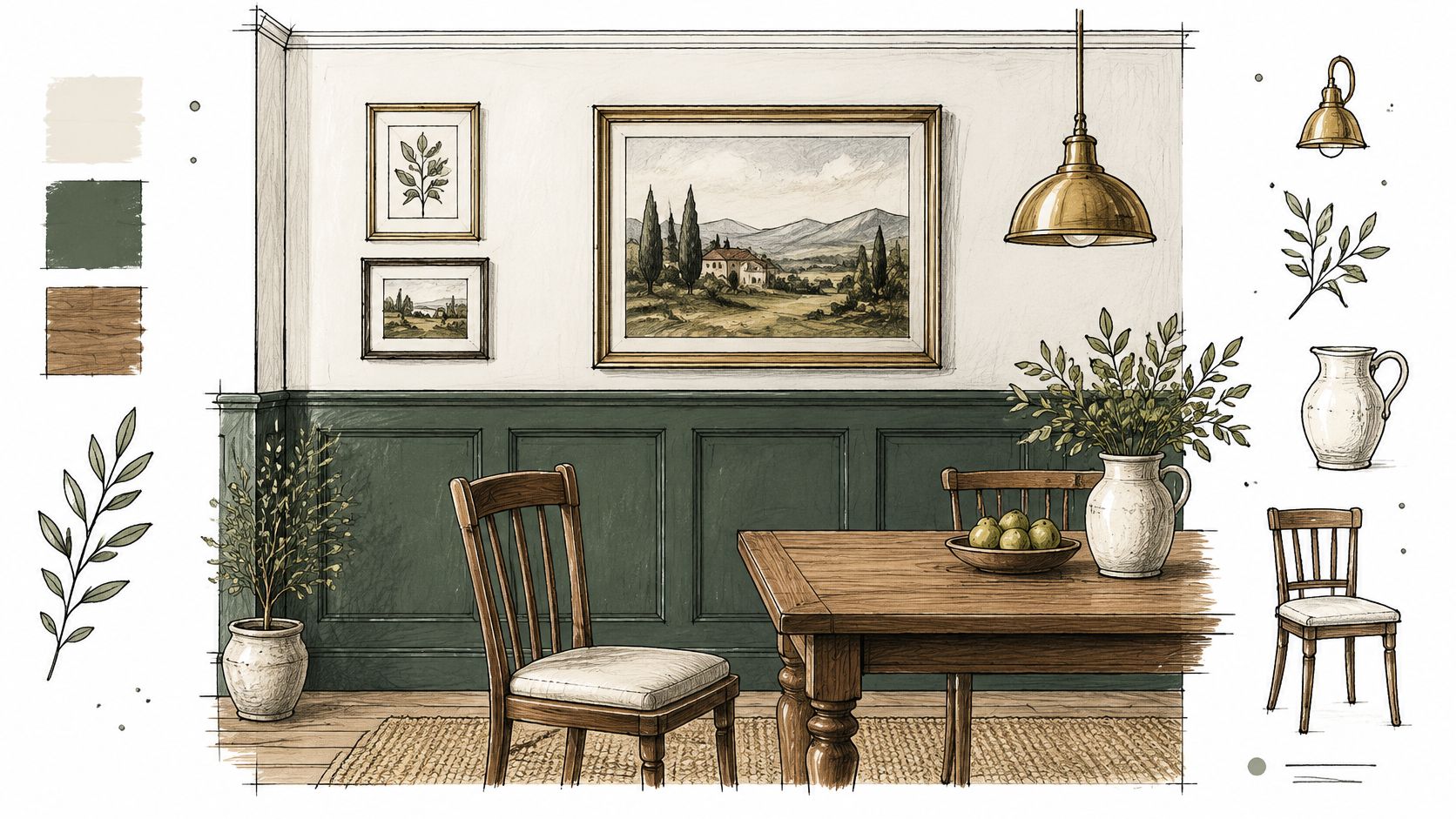
Without molding, establish the boundary from the room's proportions and existing details. Mock it up with removable tape, then inspect how it meets window aprons, switches, outlets, and door casings. Don't move the line up and down to dodge every obstruction.
The Re-Design guidance on two-tone paint recommends washable satin or eggshell below and flat or matte above, while recognizing that sheen changes and horizontal boundaries can expose uneven surfaces. On patched Bronx apartment walls, a consistent low-sheen finish may look better than a glossy lower band.
Make the Line Buildable
Use a laser level to establish a reference, then compare it with the floor, rail, and window trim. Older buildings don't always give you parallel surfaces. Where an existing chair rail wanders, decide whether to repair it or follow its edge rather than painting an unrelated level stripe above it.
A sharp color boundary makes a crooked substrate easier to notice. Tape can't correct plaster that needs flattening.
For a taped junction, let the base coat dry sufficiently before applying delicate-surface tape. Burnish the paint-side edge gently, avoid flooding it with paint, and remove the tape according to the coating and tape instructions.
Keep labeled touch-up paint for each field. If a repair flashes visibly, repaint that whole section to its natural boundaries instead of repeatedly brushing a larger halo around the patch.
3. Contrasting Ceiling and Wall Colors
A soft blue ceiling over warm off-white walls suits a brownstone bedroom when you want color without interrupting the wall space. A darker ceiling can make a tall room feel more enclosed and intimate, but it isn't an automatic improvement for a low, dim apartment.
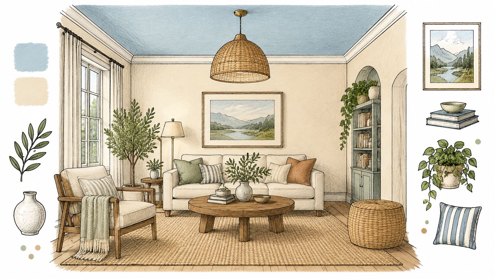
Evaluate brightness, not just the color name. Resene's architectural guidance defines Light Reflectance Value, or LRV, on a scale from 0 to 100, with lower values absorbing more visible light and higher values reflecting more. Test adequately covered samples on the actual ceiling because the substrate, sheen, and lighting affect what you'll see.
Decide Who Owns the Crown Molding
With substantial prewar crown molding, choose whether it belongs visually to the ceiling or the walls. Painting it the ceiling color creates a broader overhead field; matching the walls keeps the ceiling boundary at the molding's upper edge. Adding an unrelated trim color can make an otherwise restrained scheme unnecessarily busy.
- Sample overhead. View the color from the doorway, bed, and seating position, not just while standing beneath it.
- Favor low glare. A ceiling-specific flat finish is a useful starting point for dry rooms with imperfect plaster.
- Work from the top down. Complete ceiling repairs and painting before finishing the walls.
Our interior painting services cover the surfaces involved in this kind of coordinated repaint.
Don't paint over water stains or moving cracks without addressing their cause. A colored ceiling draws attention upward, including toward repairs that a plain ceiling might have made less noticeable.
4. Tonal Two-Tone (Same-Hue Light and Dark)
Use tonal contrast when you want definition without a graphic stripe. Pale sage walls with deeper sage trim can suit an open-plan Brooklyn apartment, while light taupe walls and darker mushroom doors can connect adjoining rooms in a Westchester renovation.
The useful distinction is depth, not merely whether the paint names sound related. Colors from the same sample strip are a starting point, but they aren't a guarantee of harmony beside your flooring, upholstery, or existing stone.
Test the Pair as a Finished Assembly
Paint adjacent samples that include the intended sheens. A satin trim sample beside an eggshell wall sample gives you more useful information than separate flat color cards. Inspect the pair in window light and under the lamps you'll really use.
For an open-plan example, carry pale greige across the living and dining walls, then use a deeper related greige on door casings and built-in shelving. Keep the ceiling quiet unless there's a clear architectural reason to introduce another boundary.
- Choose a readable difference. If the colors look identical at normal viewing distance, the extra cutting-in may not be worthwhile.
- Watch the undertones. A supposedly neutral pair can separate into pink and green beside warm wood.
- Repeat intentionally. Use the same trim assignment through connected rooms rather than reversing the colors at every doorway.
There's also a good reason to skip two tones entirely. Apartment Therapy's coverage of Fixr's 2025 survey of 67 designers and stagers reported that 55% expected color drenching to lead the year. That's a trend finding, not a rule, but a unified color can be the better choice when a small room already contains numerous edges.
5. Two-Tone Bathroom Vanity and Walls
In a small Manhattan bathroom with white tile, a charcoal vanity can supply enough contrast on its own. You don't also need a dark lower wall, contrasting ceiling, and accent door. Let the vanity be the focal point and keep the remaining painted surfaces coordinated.
The split is straightforward: the complete vanity cabinet receives the accent color, and the walls receive the field color. Include exposed side panels, fillers, and toe kicks in that decision so the vanity reads as a complete piece.
Fix Moisture Before Choosing Sheen
A bathroom-rated wall coating won't rescue a damp cabinet or failing ventilation. Check for plumbing leaks, swollen cabinet edges, loose caulk, and condensation before preparing surfaces. If a particleboard vanity has expanded or crumbled, replacement may be more sensible than refinishing.
Use a coating system suited to each substrate. Washable bathroom paint belongs on the walls; cabinet enamel belongs on the vanity. Satin or semi-gloss can work, but compatibility and preparation matter more than choosing the shinier option.
- Remove contamination. Clean soap film, cosmetics, and greasy residue before sanding or priming.
- Verify adhesion. Laminate and slick factory finishes need a compatible bonding primer and a test patch.
- Protect the cure. Dry-to-touch paint isn't necessarily ready for wet towels, cleaning products, or standing water.
For a Bronx bathroom with beige stone, consider a muted green vanity and warm off-white walls rather than forcing a cool navy-and-white palette.
When the work also involves ventilation, plumbing, or vanity replacement, plan it as a coordinated bathroom renovation. Complete wet and dusty work before the finish coats, and leave access to shutoff valves and serviceable fittings.
6. Two-Tone Exterior Body and Trim (Brownstone and Townhouse Style)
A brownstone isn't a blank canvas for an exterior color scheme. Distinguish actual stone, brick, stucco, painted wood, and metal before deciding what should receive paint.
For a townhouse with sound, previously painted wood details, a muted body color with cream window surrounds can emphasize the architecture. Where the masonry is unpainted, the better two-tone approach may be to leave it alone and coordinate the cornice and entry door instead.
Separate Design Decisions from Permission
Check the building's landmark status and applicable review process before ordering materials or scheduling a color change. Don't assume that an existing painted facade makes every proposed treatment acceptable. For a co-op or condominium, establish who controls the facade, windows, doors, and shared architectural elements before defining the scope.
Our painting process includes handling applicable co-op and condo building approvals. That coordination belongs before mobilization, not after the crew arrives.
Exterior rule: Identify the substrate and the source of peeling before selecting the finish. A new color won't correct trapped moisture or deteriorated masonry.
Prepare wood, metal, and masonry with products designed for those surfaces. Remove unsound coatings using an appropriate method, repair defects, and prime exposed or problem areas with a compatible system. Don't specify the same primer for everything just because the finish colors match.
For a Westchester house with painted siding, warm cream with deep green trim and a coordinated door is a workable example. Keep gutters, downspouts, and utility penetrations visually quiet unless they deserve emphasis.
Schedule application around dry surfaces, suitable temperatures, and the coating's weather window. An attractive palette isn't worth an exterior film applied over damp material.
7. Two-Tone Trim and Door Scheme
Black interior doors against off-white walls can sharpen a plain apartment. In a prewar home with substantial casings, a softer charcoal or warm mushroom may preserve the molding's detail without outlining every opening so aggressively.
Decide whether the accent belongs to the door slab, the casing, or both. A dark slab inside light casing creates a different effect from a fully dark doorway. Repeat that assignment consistently along a hallway.
Prepare Detail Without Erasing It
Old trim often carries thick paint at panel corners, hinges, and molding profiles. Another heavy coat can obscure those details and tighten door clearances. Inspect the coating history before disturbing old finishes, especially where lead-era paint may be present.
Don't start dry sanding unknown old coatings in an occupied prewar apartment. Establish a lead-safe preparation approach first, with containment and cleaning appropriate to the work. Our on-site scope visit includes checking for lead-era coatings as well as plaster damage and moisture.
Once the preparation method is established:
- Clean contact areas. Remove hand oils around knobs, latch edges, and door frames.
- Repair selectively. Fill damage without burying intentional joints or decorative profiles.
- Control the film. Use a quality synthetic brush and a suitable fine-finish roller, keeping the coating out of hinges and hardware.
- Plan door handling. Removed doors can be finished horizontally where space permits, but label hardware and preserve the correct fit.
Satin enamel can provide definition without the glare of a high-gloss finish. Gloss looks crisp on excellent preparation, but it also makes ripples and patched areas easier to see.
For a narrow Bronx hallway, try deeper doors with light walls and matching light casings before committing to dark trim everywhere.
8. Two-Tone Staircase (Risers and Treads Contrast)
Natural wood treads with warm white risers are a practical brownstone combination when the tread finish is worth preserving. If the wood is badly mismatched or previously painted, dark painted treads with lighter risers may be more coherent.
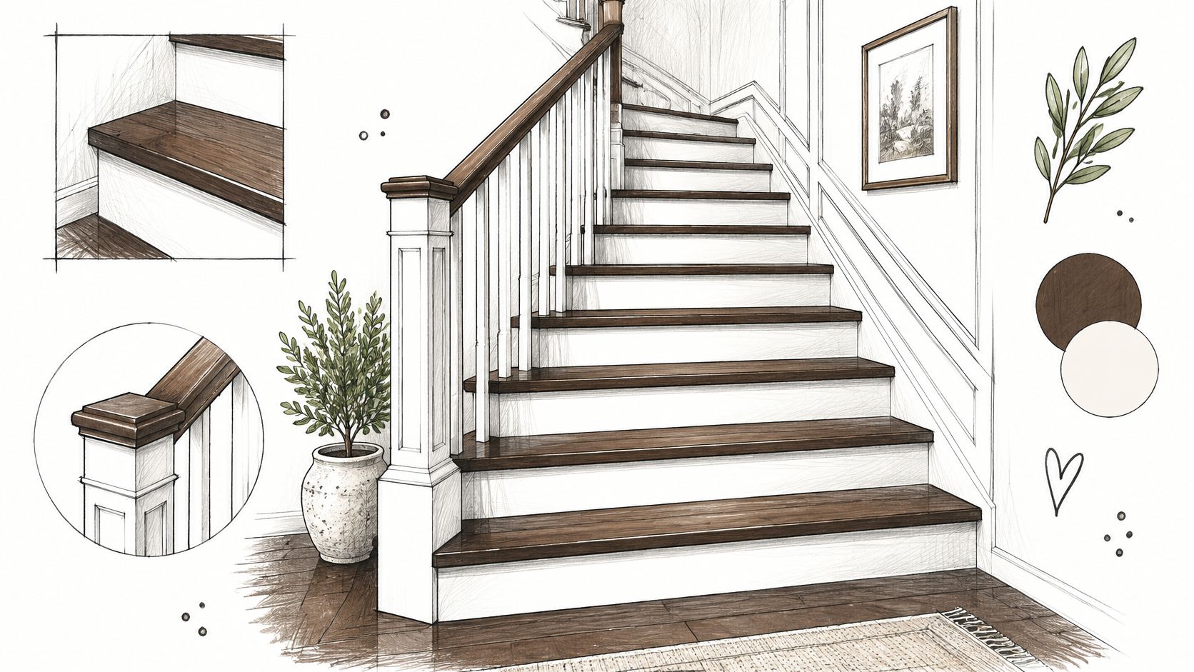
Treat contrast as a visibility decision as well as a decorative one. BNP Media's architectural guidance on visible light and paint specification identifies reflectance contrast as useful for distinguishing spaces, edges, and potential hazards. That doesn't make contrasting stair paint a substitute for sound treads, appropriate lighting, secure handrails, or slip resistance.
Plan Access Before Opening the Paint
An occupied townhouse needs a safe circulation plan. Painting alternating treads isn't automatically safe, particularly for children, older residents, or anyone carrying belongings. If residents can't avoid wet or curing surfaces safely, arrange another access solution or revise the schedule.
Use a floor-rated coating on painted treads, not trim enamel. Match any slip-resistant additive to the coating system, and understand that a lower sheen alone doesn't establish adequate traction.
Paint risers and stringers with a compatible durable finish, keeping buildup away from tread edges and joints. Repair loose components before cosmetic preparation, and protect retained wood from primer and enamel drips.
A second workable scheme is stained treads with painted balusters and a darker handrail. It introduces contrast without painting the walking surface. In either version, record the finish products and colors so later maintenance doesn't produce a patchwork of mismatched whites or incompatible clear coats.
Comparing the 8 Two-Tone Paint Schemes
The best split usually follows a feature already built into the home. This comparison focuses on where each scheme fits and how much layout or finish coordination it typically requires.
| Scheme | Where It Works Best | Difficulty | Key Consideration |
|---|---|---|---|
| Two-Tone Kitchen Cabinets (Upper and Lower Contrast) | Kitchens in Bronx apartments, Westchester homes, and NYC brownstones | Moderate | Check how the two colors read against the countertop and cabinet hardware |
| Two-Tone Walls with Wainscoting or Chair Rail Split | Dining rooms, entryways, and hallways in prewar apartments and single-family homes | Moderate | Set the split to relate to the existing rail or panel layout |
| Contrasting Ceiling and Wall Colors | Bedrooms, dens, and living rooms in brownstones, co-ops, and single-family homes | Moderate | Sample the ceiling color from the main viewpoints in the room |
| Tonal Two-Tone (Same-Hue Light and Dark) | Whole-home renovations and open-plan spaces | Easy | Keep enough value contrast for the two shades to remain distinct |
| Two-Tone Bathroom Vanity and Walls | Bronx bathroom renovations and small powder rooms in NYC apartments | Moderate | Make sure the vanity color works with the existing tile |
| Two-Tone Exterior Body and Trim (Brownstone and Townhouse Style) | Brownstone and townhouse facades in Brooklyn, Harlem, and the Bronx; Westchester homes | Difficult | Choose a trim color that suits the facade's masonry and architectural detail |
| Two-Tone Trim and Door Scheme | Whole-home painting projects and apartment refreshes | Easy | Keep the trim and door colors consistent across adjoining rooms |
| Two-Tone Staircase (Risers and Treads Contrast) | Brownstone and townhouse entryways, and single-family homes in Westchester | Difficult | Coordinate the painted details with any exposed woodwork |
Picking Your Split and Choosing the Right Two-Tone Scheme
Two schemes can both suit a room. Choose the one that gives each color a clear job without creating extra transitions. In a compact kitchen, for example, contrasting cabinetry can define the work area while a tonal wall scheme keeps the adjoining dining space connected. If both schemes compete for attention, use contrast in the more permanent feature and keep the surrounding surfaces quieter.
Let fixed finishes set the limits. Flooring, countertops, tile, exposed brick, and retained wood all affect how paint colors read. A pair that seems balanced on a sample card may clash beside warm stone or a cool tiled floor.
Match the Scope to the Room
- For compact kitchens and bathrooms, put the stronger contrast on cabinets or the vanity rather than dividing every surrounding surface.
- For traditional rooms, let the existing architectural details determine where color changes make sense.
- For open-plan interiors, carry a restrained tonal pair across connected spaces instead of introducing a new combination in each zone.
- For exteriors and stairs, resolve surface condition, access, permissions, and coating suitability before settling on colors.
Check samples on the actual surfaces, using the intended finish where possible. View them from the places where the colors will be seen. A ceiling sample viewed from below or a cabinet sample beside the backsplash gives a more useful comparison than a paint chip held near a window.
Record the complete finish specification: manufacturer, color, product, sheen, primer, and the surface assigned to each color. Keep the application consistent across each painted field. Differences in roller texture or sheen can show even when the color matches.
Preparation determines whether a crisp split stays crisp. Repair unstable plaster, address moisture, assess old coatings before disturbing them, and plan stopping points that can be maintained later. In prewar apartments and brownstones, sound surfaces and clean transitions matter as much as the color pairing.
Excellent Home Improvement includes color consultation with every estimate. Its painting work includes surface preparation and premium finishes, with interior and exterior painting offered across Westchester.
The strongest scheme is the one that fits the room's fixed finishes, use, and maintenance needs without adding boundaries the architecture cannot support.
Excellent Home Improvement offers a free on-site color and scope visit, with color consultation included in every estimate. Visit Excellent Home Improvement to book a walkthrough, compare two-tone options against your existing finishes, and choose a room for the project.